|
|
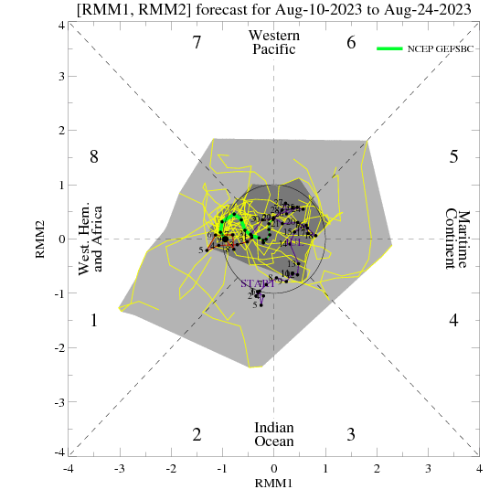
Phase diagram showing the evolution of the last 40 days of observations along with the 15 day bias-corrected ensemble GFS forecast. The yellow lines are the 21 ensemble members and the green line is the ensemble mean (thick-week 1, thin-week 2). The dark gray shading depicts 50% of the members fall in this area and the light gray shading indicates 90% of the members fall in this area. |
|
Name and PID: NCEP Global Bias-Corrected Ensemble Forecast System (NCPB) |