Two types of maps encompassing the United States are provided for overlapping two- and three-month periods. Both types of charts are based on ranking mean precipitation from the 102-year climate division record for a particular period (like January through March) from wettest (rank 1) to driest (rank 102) year, and mean temperature from coldest (rank 1) to warmest (rank 102) year. A substantial number of two-month charts are provided because features of seasonality in La Nina signatures are obscured in the three-month maps. A strong physical and statistical case can be made for the most prominent changes in the included charts.
One set of charts show the average ranks of temperature and precipitation for each two- and three-month or other period for those years with strong La Nina episodes in progress during the period. These are straight forward to interpret.
The second set of maps contains more detailed information than the first set, but requires additional description to interpret. Specifically, these maps show the number of times in the past during strong La Nina episodes that the mean temperature (precipitation) ranked among the warmest (wettest) or coldest (driest) third of the 102-year climate division record dating back to 1895. This information is depicted only for those climate divisions where the distribution of occurrences in the tercile classes of above, near, and below normal departed sufficiently from a uniform distribution that the odds of the departure being an accident were less than about 10%.
Thus, this set of charts not only provides insight into what kind of conditions La Nina favors in a specific area for a specific time of year, but also how reliably those conditions were observed in past strong El Nino episodes.
The number of cases that fall in the tercile class that the distribution is skewed towards is color coded; for example on the seasonal precipitation charts when most of the La Nina years at a location were wet the number of years is denoted by a green shade covering the climate division, but when most were dry the number of cases is indicated by a brown to yellow shade. For each colored division on a chart the number of La Nina years that fall in the opposite tercile class (for example the driest third for divisions that are colored a green shade on the precipitation charts) is denoted by a number. Thus for every two- and three-month at every climate division the complete distribution among temperature and precipitation terciles for strong La Nina episodes can be determined from the diagrams.
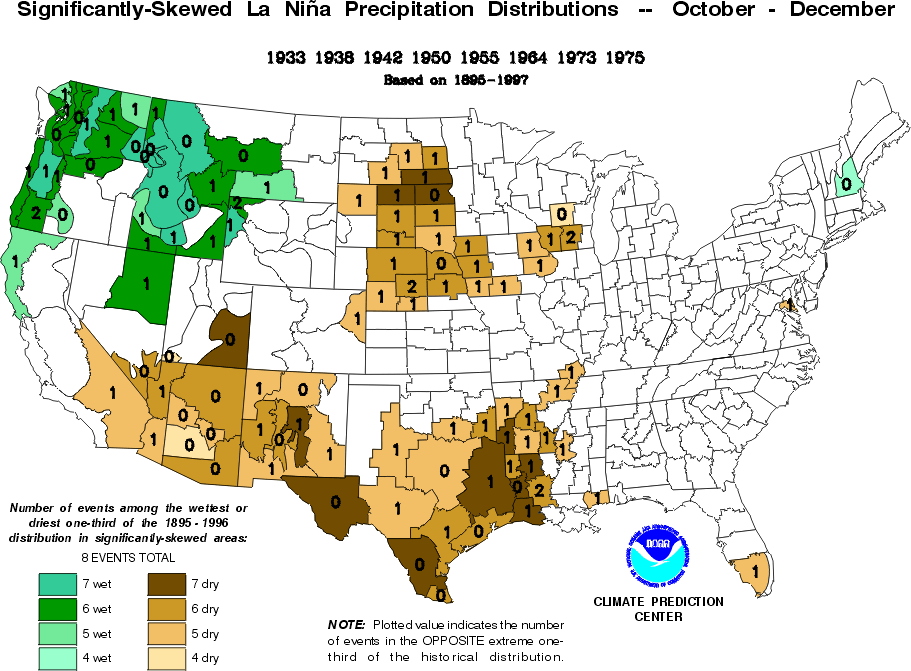
For specific examples refer to the [October thru December] precipitation
chart constructed from 8 strong La Ninas: For West Texas six of the
La Nina years were among the driest third, and only one of eight
among each of the middle and wettest thirds, while for the Olympic
Peninsula in the Northwest the distribution was almost the opposite,
i.e. two among the driest, none among the middle, and six among the
wettest. Thus, suitably smoothed, the information on the diagrams can
be used to formulate a priori probabilities of the different
temperature or precipitation classes conditional on a high-confidence
La Nina forecast.
The years representing strong La Ninas change from period to period. This is because the part of the year for which the central Equatorial Pacific sea surface temperatures (SSTs) are well below normal differs from episode to episode. The cases that were included are those for which the average SST in a prescribed area was close to or greater than one degree Celsius below normal in at least one of the two or three months spanning a particular period and greater than eight-tenths of a degree Celsius below normal in the remaining months. The key area used for case selection is bounded by the Dateline and 150 west longitude and 5 north and 5 south latitudes. This area was used because it approximates the region in the equatorial Pacific where tropical convection and rainfall (the major source of atmospheric energy in the tropics) are the most sensitive to relatively small changes in SST. Thus, the SST anomaly in this area should be a good index of how strong an La Nina's impact on the global atmosphere will be.
Note also that precipitation charts are constructed from more years
than the temperature charts; for the former La Ninas for the 1930s were
included as candidates for selection but not for the latter. This is because
the large-scale trends in the temperature data are larger than those in
the precipitation data. Even with this restriction to the 1940-1996 period
the temperature series are still likely to be somewhat nonstationary, so
the temperature distributions should be used with more caution than the
precipitation distributions.
Contact: Dr. Robert E. Livezey, 301-763-8155 (Ex. 7527), livezey@sgi84.wwb.noaa.gov